LOGO DESIGNS CRAFTED WITH INTENTION

Bespoke designs, based around audience psychology, built to resonate and communicate.

Iron Grip

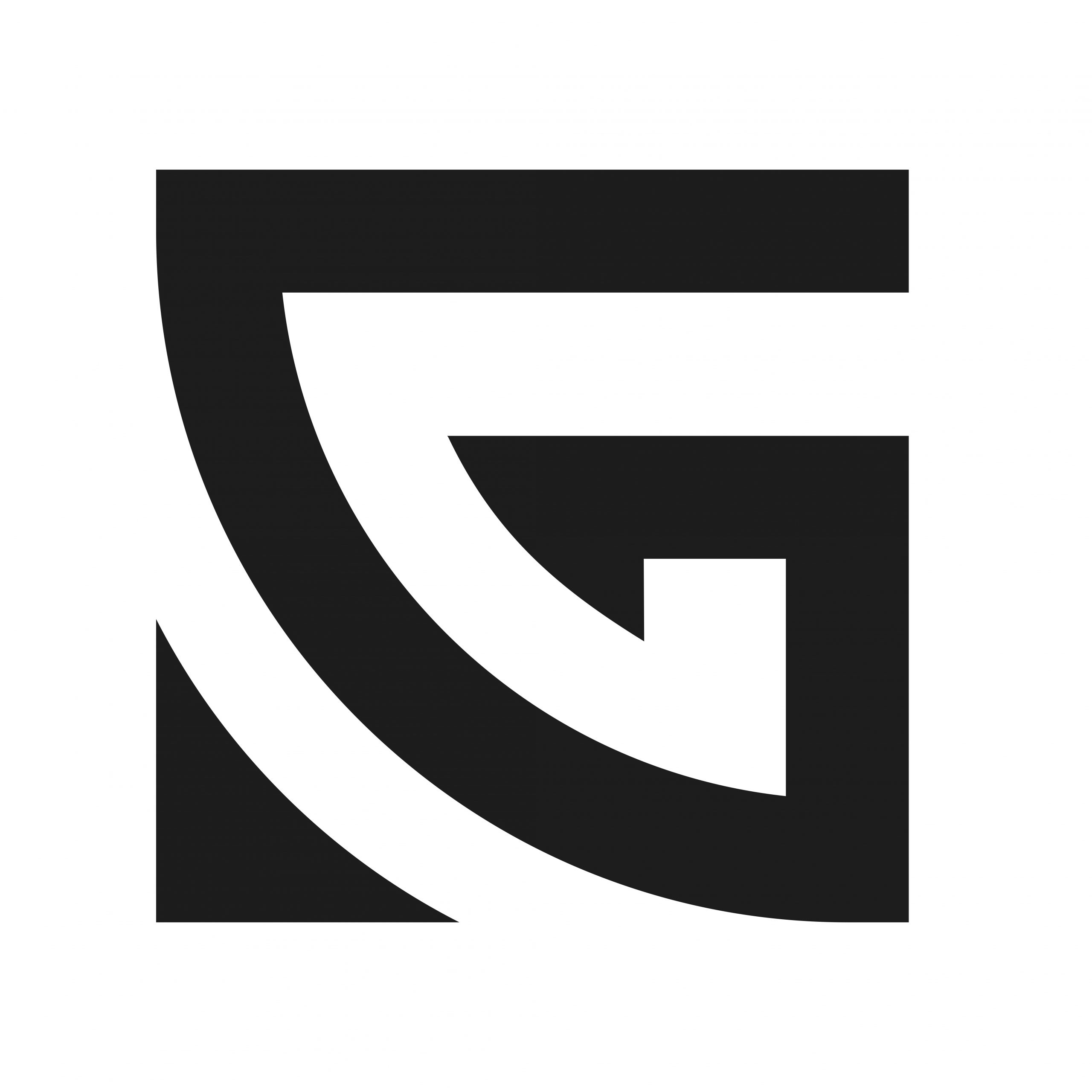
The IronGrip logo was built on intentional shape psychology to reflect both the power and inclusivity of Brazilian Jiu Jitsu.

The core structure forms a hidden “G,ˮ representing growth, grip, and grounded control— three principles central to the sport. The bold geometric angles communicate strength, stability, and resilience, while the sweeping internal curve introduces movement and flow, echoing the technical fluidity of grappling.

The square-based version was originally developed to symbolize a solid, unbreakable foundation; however, the final triangle form aligns even more closely with Jiu Jitsuʼs philosophy. The result is a mark that feels robust and commanding, yet open and welcoming, capturing Iron Gripʼs mission to build confidence, community, and continuous improvement for practitioners of all ages and levels.


IronGrip icon
IronGrip training facility
IronGrip apparel mockup

Vespula

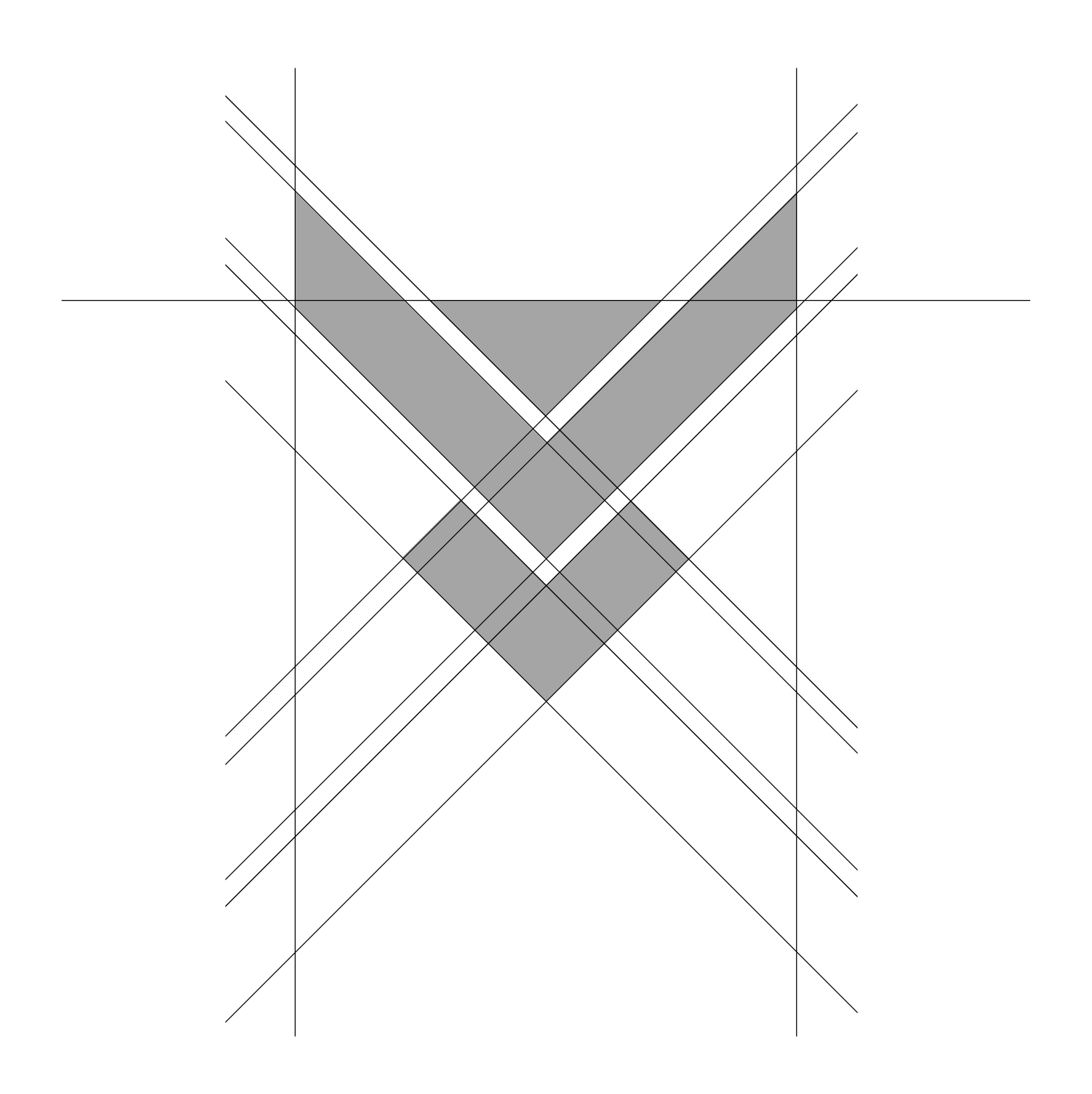
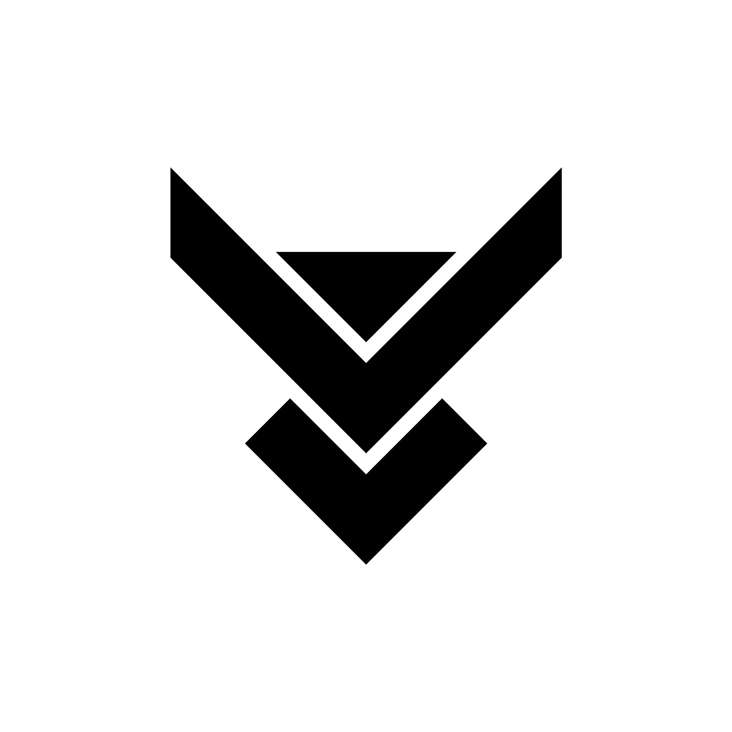
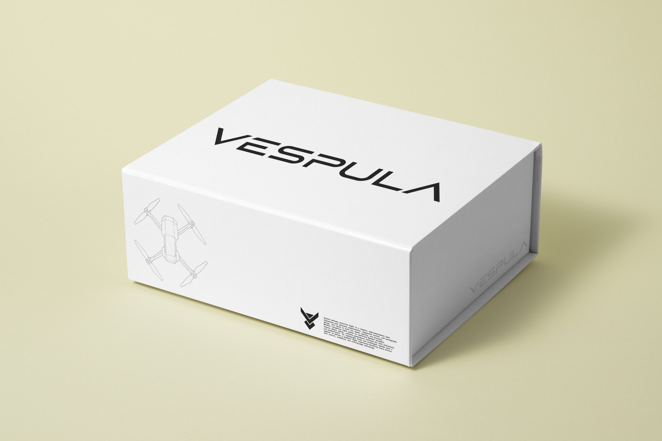
The Vespula logo was designed with precision, aerodynamics, and modern shape psychology at its core. Its angular, V-shaped geometry creates an immediate sense of speed, direction, and uplift, mirroring the rapid ascent and agile maneuverability of a high-performance drone.

Hidden within the mark is a subtle nod to the name “Vespulaˮ—a genus of wasp—capturing the fast, reactive, high-awareness nature of the technology without relying on literal imagery.

The minimalist structure keeps the brand clean and futuristic, making it approachable for beginners yet professional enough for advanced pilots. The result is a logo that feels sleek, intelligent, and aerodynamic, perfectly aligned with Vespulaʼs mission to deliver refined performance and next-generation flight experience.

GL icon
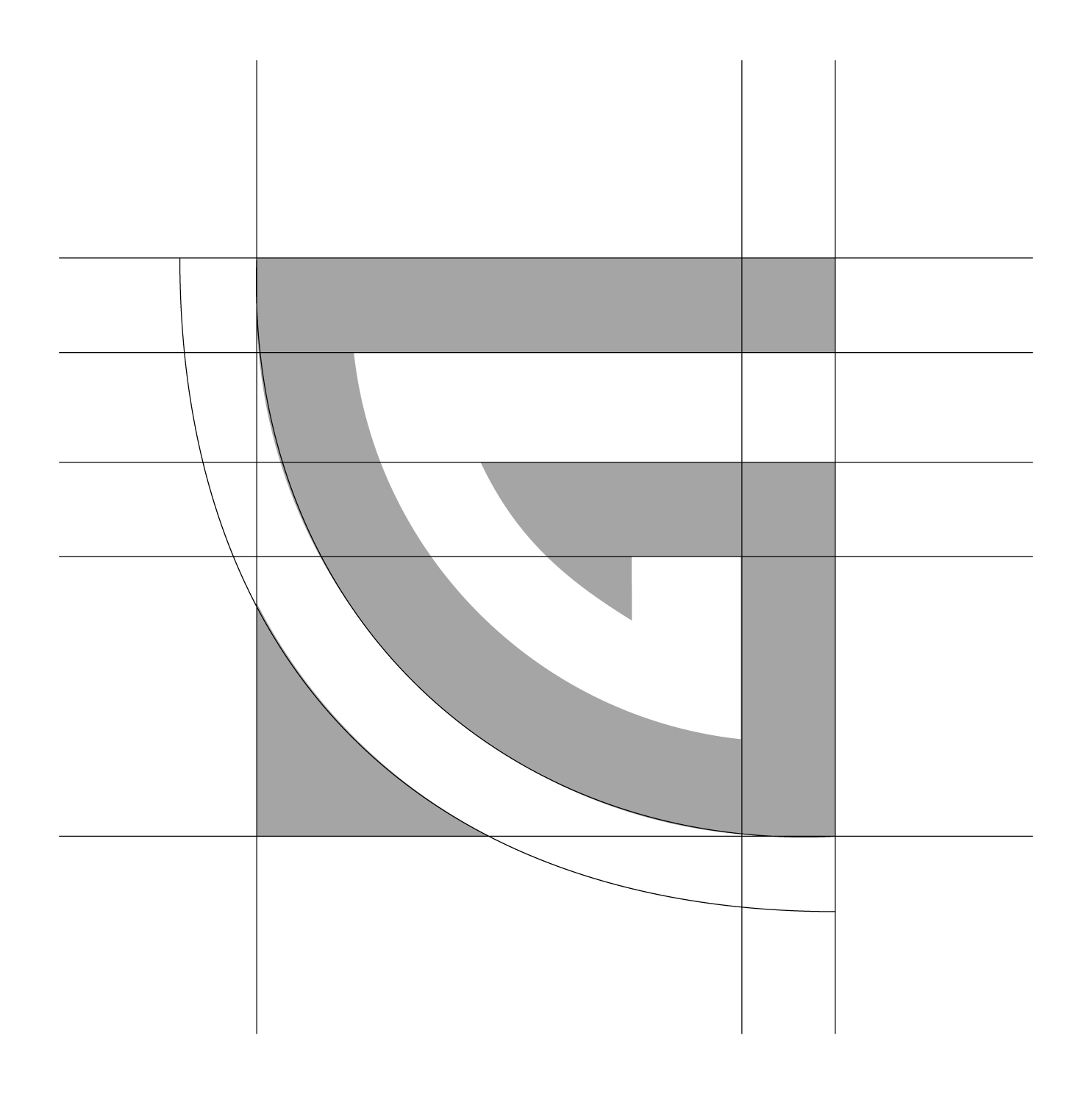
GL construction grid

GRI

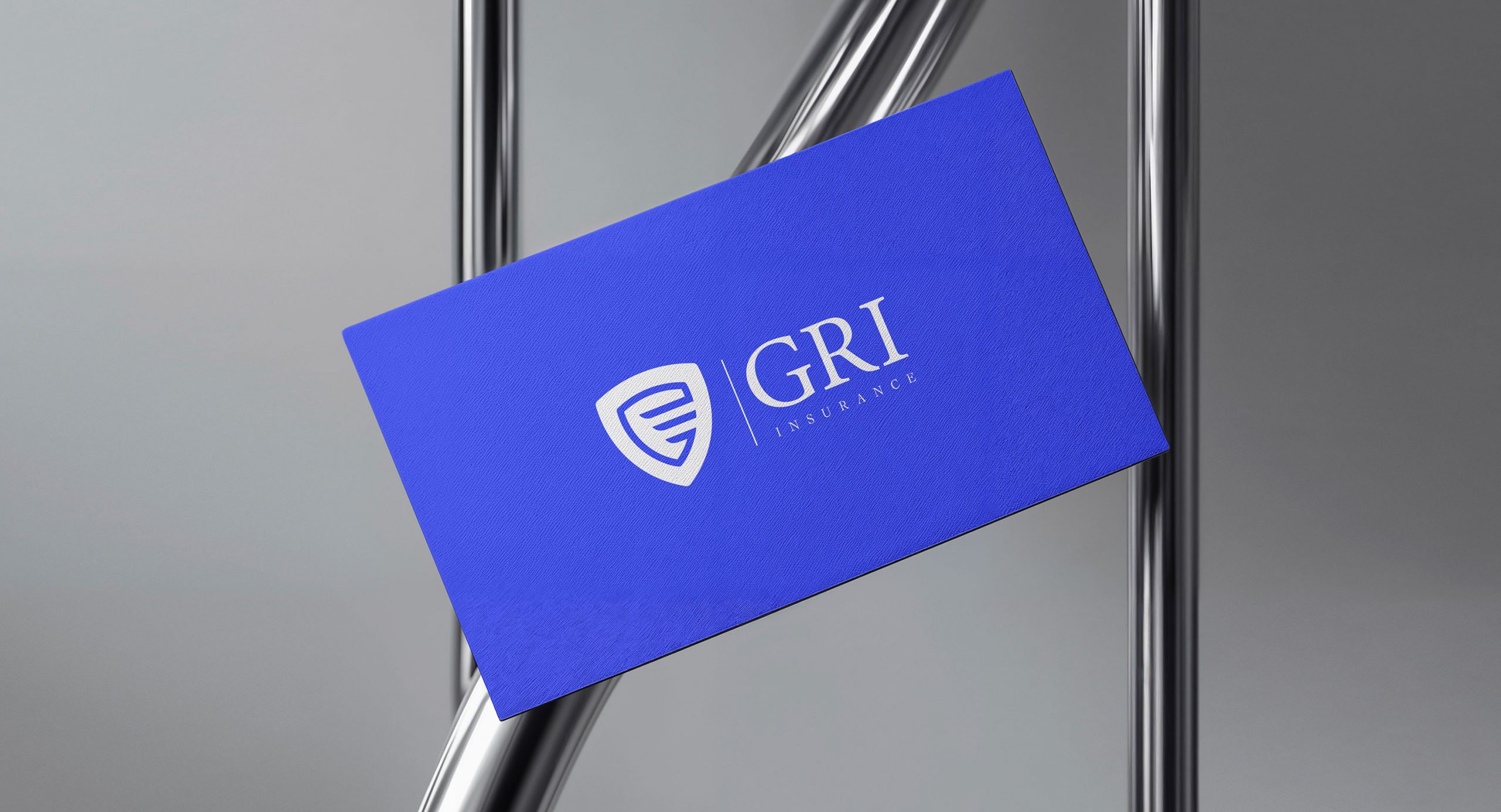
The GRI logo is anchored in the universal symbolism of the shield, one of the oldest visual metaphors for protection and security.

Its rounded contour softens the form, signaling approachability and trust rather than aggression, while still conveying strength and reliability. Inside the shield, the horizontal lines create a calm, stable rhythm; in shape psychology, horizontal elements are associated with peace, balance, and steadiness—reassuring qualities for anyone seeking financial protection.

Together, the mark communicates safety, stability, and confidence: a promise that GRI stands as a steady, protective barrier in moments of uncertainty, offering clients peace of mind and dependable support when it matters most.

GL icon
GL construction grid

Start a logo project

Tell me about your brand, goals, and constraints. I’ll reply with a tailored process outline and timeline.

Thank you!
We will get in touch with you soon!
Verified by MonsterInsights